
24년 6월을 기준으로 작성되었습니다.
0. 기본 위젯 알아보기
※ Flutter는 RichText 위젯과 Paragraph와 같은 클래스도 제공한다.
https://docs.flutter.dev/ui/widgets/text
Text widgets
A catalog of Flutter's widgets for displaying and styling text.
docs.flutter.dev
1. IconButton / TextButton 위젯
Flutter에서는 글리프(glyph) 기반의 아이콘을 사용할 수 있다.
기본으로 제공되는 아이콘 목록은 아래 링크에서 확인할 수 있다.
https://fonts.google.com/icons
Material Symbols and Icons - Google Fonts
Material Symbols are our newest icons consolidating over 2,500 glyphs in a single font file with a wide range of design variants.
fonts.google.com
TextButton 위젯
※ [24년 6월 수정사항]
TextButton.styleFrom() 에서 primary 파라미터 대신 -> foregroundColor 파라미터를 사용한다.
  return Center(
    child: TextButton(
      style: TextButton.styleFrom(
        foregroundColor: Colors.grey,
      ),
      onPressed: onPickImage,
      child: Text('이미지 선택하기'),
    ),
  );
2. GestureDetector 위젯, InkWell 위젯
✅ GestureDetector 위젯
플러터에서 지원하는 모든 제스처들을 구현할 수 있는 위젯이다.
제스처가 인식되면 파라미터에 입력된 콜백 함수가 실행된다.


➡️ onScaleUpdate 파라미터 (제스처)
확대가 진행되는 동안, 확대가 업데이트될 때마다 실행되는 함수를 입력한다.
이 제스처는 ScaleUpdateDetails를 첫번째 매개변수로 입력받는다. ScaleUpdateDetails는 굉장히 많은 정보를 제공한다.
1) details.scale : 확대 배율, 확대/축소 제스처가 "시작된 순간"을 기준으로 몇 배율의 변화가 있는지 알려준다.
배율은 위젯의 "초기 크기" 기준이 아니기 때문에, onScaleEnd 파라미터가 실행될 때 현재 배율을 꼭 기억해두어야 한다.
그래야 [최근 배율 * details.scale] 을 계산해서, 위젯의 초기 크기 기준으로 배율을 계산할 수 있다.
2) details.focalPointDelta : dy값 및 dx 값을 갖고 있다. 각각 y축 및 x축으로 이동한 수치를 반환받는다.
이 수치를 변수로 저장해두고, 확대/축소 제스처에 대한 콜백이 실행될 때마다 변수들을 업데이트하면, 사용자가 의도한 위젯의 변화를 상태관리 할 수 있다.
➡️ onScaleEnd 파라미터
확대가 끝났을 때 실행되는 함수를 입력한다.
➡️ behavior 파라미터
꼭 구현해주는 것이 좋다고 한다.
1. HitTestBehavior.translucent : 위젯의 빈 공간에 제스처를 입력해도, 실행된다.
✅ InkWell 위젯
GestureDetector 보다는 기능이 적지만, 기본적인 애니메이션이 구현되어 있어서 약간의 편리함을 챙긴 위젯이다.
※ Material 위젯이 상위 위젯에 있어야 한다!
https://api.flutter.dev/flutter/material/InkWell-class.html
InkWell class - material library - Dart API
A rectangular area of a Material that responds to touch. For a variant of this widget that does not clip splashes, see InkResponse. The following diagram shows how an InkWell looks when tapped, when using default values. The InkWell widget must have a Mate
api.flutter.dev
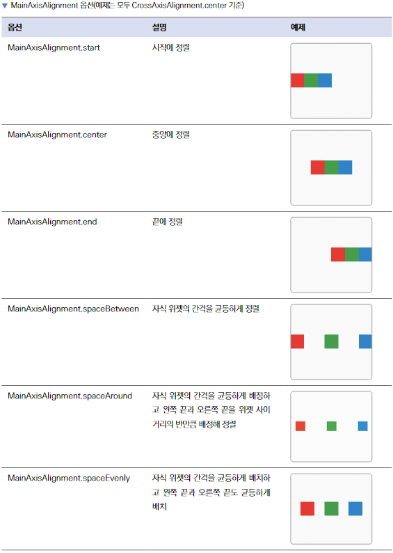
3. Row 위젯
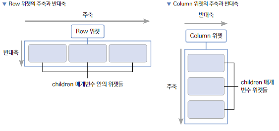
주축은 mainAxisAlignment 로, 반대축은 crossAxisAlignment 로 배치한다.

4. Column 위젯


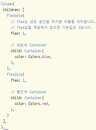
5. Flexible 위젯
Flexible 위젯은 Row나 Column에서 사용하는 위젯이다.
Flexible에 제공된 child가 Column/Row 안에서 크기를 "최소한" 으로 차지하게 할 수 있다.
추가적으로 flex 파라미터를 통해, 각 Flexible 위젯이 얼만큼의 비율로 공간을 차지할지 지정할 수도 있다.
➡️ fit 파라미터
FlexFit.loose : 자식 위젯이 필요한 만큼의 공간만 차지한다.
FlexFit.fit : 자식 위젯이 남은 공간을 모두 차지한다.
6. Expanded 위젯
Flexible 위젯을 상속한 다음, fit 파라미터에 FlexFit.tight를 기본으로 제공해준 위젯이다.
그래서 Flexible 위젯과 다르게 남는 공간을 최대한으로 차지하게 된다.

7. Image 위젯
Image 위젯은 다음과 같이 5가지 생성자가 있다.

※ 요즘 OS의 개발 정책이 보안을 강조하기 때문에, Image.file 생성자는 점차 사장되는 추세이다...
➡️ 이미지 크기 조절
width / height 파라미터
8. 로딩 애니메이션 위젯 2가지
LinearProgressIndicator : 일자 형태
CircularProgressIndicator : 동그라미 형태
➡️ 색상 파라미터
Linear / Circular 둘 다 제공한다.
backgraoundColor : 위젯의 배경 색상
valueColor : 실제로 애니메이션으로 움직이는 부분의 색상
valueColor는 색상이 애니메이션 되어야 하기 때문에, AlwaysStoppedAnimation 이라는 클래스에 감싸서 색상을 제공해야 한다.
  CircularProgressIndicator(
    valueColor: AlwaysStoppedAnimation(
      Colors.white,
    ),
  ),
9. Scaffold 위젯
➡️ appBar 파라미터와 AppBar 위젯
actions 파라미터 : 이 파라미터(리스트)에 위젯을 입력하면, AppBar의 우측 끝에 순서대로 위젯이 배치된다.
10. PageView 위젯
여러 개의 위젯을 단독 페이지로 생성하고 가로 또는 세로 스와이프로 페이지를 넘길 수 있게 하는 위젯이다.
PageView는 PageController를 사용해서 조작할 수 있다.
보통 PageController를 State에 선언하고 PageView의 controller 속성에 파라미터로 입력하면 된다.
그러면 해당 컨트롤러로 PageView를 조작할 수 있다.
11. Text 위젯
Text 위젯을 스타일링할 때는 style 파라미터를 사용하면 된다.
하지만 Text 위젯의 개별 스타일이 아니라 -> 기본 스타일을 변경하고 싶다면 테마(Theme)를 사용하면 편하다.
테마를 사용하면, 13가지 Text 스타일을 따로 저장하여, 프로젝트로 불러와서 사용할 수 있다.
➡️ textTheme
※ [24년 6월 변경사항]
책에서 소개한 TextTheme()의 속성 중에서 headline1~6, subtitle1~2, bodyText1~2, caption, button, overline은 Deprecated 되었다.
headline1~3 -> displayLarge / displayMedium / displaySmall
headline4~5 -> headlineMedium / headlineSmall
headline6 / subtitle1 / subtitle2 -> titleLarge / titleMedium / titleSmall
bodyText1 / bodyText2 / caption -> bodyLarge / bodyMedium / bodySmall
button / overline -> labelLarge / labelSmall
12. MaterialApp 위젯
➡️ theme 파라미터
이 파라미터에는 ThemeData 클래스를 입력할 수 있다.
ThemeData에서는 플러터가 기본으로 제공하는 대부분의 위젯 기본 스타일을 지정할 수 있다.

13. Align 위젯
child 위젯을 어떻게 위치시킬지 정할 수 있다. alignment 파라미터에 Alignment 값을 입력하면 된다.

Stack 위젯 내부에서 활용된다.
14. TabBar & TabBarView 위젯 그리고 TabController 클래스
TabBar와 TabBarView를 사용하기 위해서는 "TabController" 가 필요하다.
TabController를 초기화하려면, vsync 기능이 필요한데, 이는 State 위젯에 TickerProviderMixin을 mixin으로 제공해줘야 사용할 수 있다.
또한 TabController는 위젯이 생성될 때 단 한 번만 초기화되어야 하니 --> initState()에서 초기화한다.
class _RootScreenState extends State<RootScreen> with TickerProviderStateMixin {
  TabController? controller; // 사용할 TabController 선언

  @override
  void initState() {
    super.initState();

    controller = TabController(length: 2, vsync: this); // 컨트롤러 초기화
  }

  @override
  Widget build(BuildContext context) {
    return Scaffold(
      body: TabBarView( // 탭 화면을 보여줄 위젯
        controller: controller,
        children: renderChildren(),
      ),

      // 아래의 탭 내비게이션을 구현하는 파라미터
      bottomNavigationBar: renderBottomNavigation(),
    );
  }
TickerProviderMixin & SingleTickerProviderMixin : 애니메이션의 효율을 올려준다.

✅ DefaultTabController 클래스
TabController를 선언하고 구현하는 것이 귀찮다면, 혹은 간단한 TabBar를 구현할 계획이라면,
기본으로 제공하는 "DefaultTabController" 를 사용하는 것도 좋다.
위와 같은 선언 없이 바로 DefaultTabController 내부에서 TabBar와 TabBarView를 사용할 수 있다.
  DefaultTabController(
    length: 2,
    child: Column(
      children: [
        TabBar(
          tabs: [
            Tab(text: "제품 상세",),
            Tab(text: "리뷰",),
          ],
        ),
        Container(
          height: 500,
          child: TabBarView(
            children: [
              Container(
                child: "제품 상세".text.make(),
              ),
              Container(
                child: "리뷰".text.make(),
              ),
            ],
          ),
        ),
      ],
    ),
  ),
https://api.flutter.dev/flutter/material/DefaultTabController-class.html
DefaultTabController class - material library - Dart API
The TabController for descendant widgets that don't specify one explicitly. DefaultTabController is an inherited widget that is used to share a TabController with a TabBar or a TabBarView. It's used when sharing an explicitly created TabController isn't co
api.flutter.dev
15. BottomNavigationBar -> NavigationBar 클래스
※ BottonNavigationBar는 Material2 클래스로, Material 3 버전은 NavigaitonBar 를 사용한다.
https://www.youtube.com/watch?v=DVGYddFaLv0
https://api.flutter.dev/flutter/material/NavigationBar-class.html
NavigationBar class - material library - Dart API
Material 3 Navigation Bar component. Navigation bars offer a persistent and convenient way to switch between primary destinations in an app. This widget does not adjust its size with the ThemeData.visualDensity. The MediaQueryData.textScaler does not adjus
api.flutter.dev
class _RootScreenState extends State<RootScreen> with TickerProviderStateMixin {

  @override
  Widget build(BuildContext context) {
    return Scaffold(
      body: TabBarView( // 탭 화면을 보여줄 위젯
        controller: controller,
        children: renderChildren(),
      ),

      // 아래의 탭 내비게이션을 구현하는 파라미터
      bottomNavigationBar: renderBottomNavigation(),
    );
  }

  BottomNavigationBar renderBottomNavigation() {
    // 탭 내비게이션을 구현하는 위젯
    return BottomNavigationBar(
      items: [
        BottomNavigationBarItem(
          icon: Icon(
            Icons.edgesensor_high_outlined,
          ),
          label: '주사위',
        ),
        BottomNavigationBarItem(
          icon: Icon(
            Icons.settings,
          ),
          label: '설정',
        ),
      ],
    );
  }
}
16. Slider 위젯
Slider 위젯은 눌러서 좌우로 움직일 때, 움직인 만큼의 값이 제공되는 콜백 함수가 실행된다.
이 값을 저장하고, 다시 Slider에 넣어주는 것이 중요 포인트이다.
Slider(
  min: 0.1, // 최솟값
  max: 10.0, // 최댓값
  divisions: 101, // 최솟값과 최댓값 사이 구간 개수
  value: threshold, // 슬라이더 선택값
  onChanged: onThresholdChange, // 값 변경 시 실행되는 함수
  label: threshold.toStringAsFixed(1), // 표시값
  activeColor: Colors.red, // 슬라이더의 전체적인 색상
),
https://api.flutter.dev/flutter/material/Slider-class.html
Slider class - material library - Dart API
A Material Design slider. Used to select from a range of values. The Sliders value is part of the Stateful widget subclass to change the value setState was called. link To create a local project with this code sample, run: flutter create --sample=material.
api.flutter.dev
17. VideoPlayer 위젯 (video_player 외부 패키지)
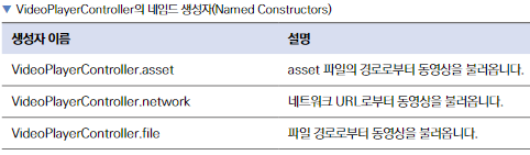
1. VideoPlayer 위젯은 VideoPlayerController로 조작할 수 있다.
initState() 함수에서, 설정할 VideoPlayerController를 선언한다.
2. 예제에서는 파일로부터 VideoPlayerController를 생성하기 때문에,
VideoPlayerController.file 생성자를 이용해서 컨트롤러를 만든다.
컨트롤러를 생성하고 나면, initialize() 함수를 실행해서 동영상을 재생할 수 있는 상태로 준비해줘야 한다.
3. VideoPlayerController를 선언할 수 있는 생성자는 대표적으로 3가지가 있다.
class CustomVideoPlayer extends StatefulWidget {
  // HomeScreen에서 선택한 동영상을 저장하는 변수
  final XFile video;

  const CustomVideoPlayer({
    required this.video,
    super.key,
  });

  @override
  State<CustomVideoPlayer> createState() => _CustomVideoPlayerState();
}

class _CustomVideoPlayerState extends State<CustomVideoPlayer> {
  // 동영상을 조작하는 컨트롤러
  VideoPlayerController? videoController;

  @override
  void initState() {
    super.initState();
    initializeController(); // 컨트롤러 초기화
  }

  initializeController() async { // 선택한 동영상으로 컨트롤러 초기화
    final videoController = VideoPlayerController.file(
      File(widget.video.path),
    );

    await videoController.initialize();

    videoController.addListener(videoControllerListener); // 리스너 등록

    setState(() {
      this.videoController = videoController;
    });
  }

   /**
   * 동영상의 재생 상태가 변경될 때마다, setState()를 실행해서 build()를 재실행한다.
   */
   void videoControllerListener() {
     setState(() {});
   }

  @override
  Widget build(BuildContext context) {
    // 동영상 컨트롤러가 준비 중일 때, 로딩 표시
    if (videoController == null) {
      return Center(
        child: CircularProgressIndicator(),
      );
    }

    return AspectRatio(
      aspectRatio: videoController!.value.aspectRatio,
      child: VideoPlayer(
        videoController!,
      ),
    );
  }
}
videoController.value.duration : 동영상의 길이
videoController.value.position : 동영상이 현재 재생되고 있는 위치
videoController.value.isPlaying : 현재 동영상이 재생 중인지 true / false 값으로 반환한다
videoController.seekTo() 함수 : 동영상의 재생 위치를 변경할 수 있다.
pause() / play() 함수 : 동영상을 일시 정지 / 재생 할 수 있다.
child: Slider( // 동영상 재생 상태를 보여주는 슬라이더
  onChanged: (double val) { // 슬라이더가 이동할 때마다 실행하는 함수
    videoController!.seekTo(
      Duration(seconds: val.toInt()),
    );
  },
  value: videoController!.value.position.inSeconds.toDouble(),
  min: 0,
  max: videoController!.value.duration.inSeconds.toDouble(),
),
동영상을 이미 선택한 상태에서도 새로운 동영상을 선택할 수 있어야 한다.
그러나, "동영상의 소스를 videoController 변수를 인스턴스화할 때 선언" 했고
현재 코드에서 "videoController 변수는 initState() 함수에서만 선언" 되기 때문에, 새 동영상이 반영되지 않는다.
StatefulWidget 생명주기의 또 하나의 함수인 didUpdateWidget() 함수를 사용해서
새로운 동영상을 선택하면 새로운 videoController를 생성하도록 코드를 추가해야 한다.
class _CustomVideoPlayerState extends State<CustomVideoPlayer> {
  // 동영상을 조작하는 컨트롤러
  VideoPlayerController? videoController;

  /**
   * covariant 키워드는 CustomVideoPlayer 클래스의 상속된 값도 허가해준다.
   * oldWidget : 파라미터의 값이 변경되어서 "폐기"되는 위젯
   */
  @override
  void didUpdateWidget(covariant CustomVideoPlayer oldWidget) {
    super.didUpdateWidget(oldWidget);

    // 새로 선택한 동영상이 같은 동영상인지 확인
    if (oldWidget.video.path != widget.video.path) {
      initializeController();
    }
  }

  initializeController() async { // 선택한 동영상으로 컨트롤러 초기화
    final videoController = VideoPlayerController.file(
      File(widget.video.path),
    );

    await videoController.initialize();

    videoController.addListener(videoControllerListener); // 리스너 등록

    setState(() {
      this.videoController = videoController;
    });
  }
17. AspectRatio 위젯
child 파라미터에 입력되는 위젯의 "비율"을 정하는 위젯이다.
비율은 "너비 / 높이" 로 입력하면 된다. EX) 16:9 비율 -> 16/9 를 입력
18. Stack 위젯
Column 위젯, Row 위젯처럼 children 파라미터에 여러 개의 위젯이 위치할 수 있다.
위젯이 list에 입력되는 순서대로 아래부터 쌓아 올려진다.
Stack 위젯은 기본적으로 children 위젯들을 정중앙에 위치시킨다.
따라서 특정 위치에 위젯을 옮기고 싶다면 Positioned 위젯을 사용해서 위치를 정해줘야 한다.
➡️ fit 파라미터
StackFit.loose : 자식 위젯들이 최소한의 크기만 차지하도록 한다.
StackFit.expand : 자식 위젯들이 차지할 수 있는 공간의 최대한의 크기를 차지하도록 한다.
19. Positioned 위젯
주로 Stack 위젯 내부에서 특정 위치에 위젯을 옮기고 싶다면 -> Positioned 위젯을 사용해서 위치를 정해준다.
top / bottom / left / right 파라미터 : 각각 위아래, 왼쪽, 오른쪽에서부터 "몇 픽셀" 에 child 위젯을 위치할지 정한다.
20. FutureBuilder 위젯
https://youtube.com/watch?v=zEdw_1B7JHY
한 마디로 말하자면, Future(비동기)를 다루는 Builder? 라고 한다.
말 그대로 Future를 반환하는 함수의 결과에 따라 -> 위젯을 렌더링할 때 사용한다.
➡️ future 파라미터
Future 값을 반환하는 함수를 넣어준다.
➡️ builder 파라미터
Future 값에 따라 다르게 렌더링해주고 싶은 로직을 작성해준다.
builder() 함수는 BuildContext와 AsyncSnapshot을 제공해준다.
1. AsyncSnapshot : future 파라미터에 입력한 함수의 결괏값 및 에러를 제공하는 역할을 한다. 추가적으로 비동기 함수의 진행 상황도 알 수 있다. AsyncSnapshot에서 제공하는 값이 변경될 때마다 builder() 함수가 재실행된다.
1-1. hasError 게터 : 현재 실행한 비동기 함수에서 에러가 있는지 bool 값으로 반환한다.
에러가 있다면, snapshot.error 를 실행해서 에러값을 가져올 수 있다.
1-2. hasData 게터 : 현재 실행한 비동기 함수에서 반환받은 데이터가 있는지 bool 값으로 반환한다.
반환받은 데이터가 있다면, snapshot.data를 실행해서 데이터값을 가져올 수 있다.
1-3. snapshot.coonectionState : 비동기 함수의 현재 실행 상태를 가져올 수 있다.

  @override
  Widget build(BuildContext context) {
    return Scaffold(
      appBar: AppBar(
        title: Text('LIVE'),
      ),
      body: FutureBuilder( // init()의 Future 값을 기반으로 위젯을 렌더링하기 위해서
        future: init(), // Future를 init() 함수로 등록한다
        builder: (BuildContext context, AsyncSnapshot snapshot) {
          if (snapshot.hasError) { // init()이 던진 에러 처리
            return Center(
              child: Text(
                snapshot.error.toString(),
              ),
            );
          }

          if (!snapshot.hasData) { // init() 실행 후, 아직 데이터가 없을 때 (= 로딩 중)
            return Center(
              child: CircularProgressIndicator(),
            );
          }

          return Center(
            child: Text('모든 권한이 있습니다!'),
          );
        }
      ),
    );
  }
🤚 !snapshot.hasData 대신 snapshot.connectionState == ConnectionState.waiting을 사용하면 안될까?
A. 캐싱(Caching) : 데이터를 일시적으로 저장하고 기억하는 것
FutureBuilder는 제공된 비동기 함수의 상태가 변경될 때마다, 상위 builder() 함수가 재실행된다.
그런데, 이 FutureBuilder는 다른 위젯과 마찬가지로 build() 함수에 영향을 받는다.
build()가 다시 실행되면 -> FutureBuilder는 다시 렌더링되고 -> builder() 함수도 다시 실행된다.
그리고 그럴 때마다 비동기 함수도 매번 다시 실행된다. 그런데 플러터에서는 무수히 많이 build() 함수를 실행한다.
그러면 build()가 실행될때마다 CircularProgressIndicator가 렌더링되어 화면에 깜빡임이 생기게 된다.
따라서 build() 함수에 snapshot.hasData를 이용해서, 기존에 반환받았던 데이터 값을 기억해두어(캐싱), 로딩 상태를 인지하고, 깜빡임을 막는 것이다.
21. GoogleMap 위젯 (goolge_maps_flutter 패키지)
➡️ initialCameraPosition 파라미터 (필수!)
CameraPosition 이라는 클래스를 입력해준다.
▶️ target 파라미터 : 지도의 중심이 될 위치를 LatLng 형태의 값으로 입력할 수 있다.
▶️ zoom 파라미터 : 확대 정도
class HomeScreen extends StatelessWidget {
  static final LatLng companyLatLng = LatLng( // 지도 초기화 위치
    37.5233273, // 위도
    126.921252, // 경도
  );

  const HomeScreen({super.key});

  @override
  Widget build(BuildContext context) {
    return Scaffold(
      appBar: renderAppBar(),
      body: GoogleMap( // 지도 위치 지정
        initialCameraPosition: CameraPosition(
          target: companyLatLng,
          zoom: 16, // 확대 정도 (높을수록 크게 보인다)
        ),
      ),
    );
  }
➡️ markers 파라미터
google_maps_flutter 패키지가 제공하는 "Marker" 클래스를 사용해서 각 마커별로 ID를 정해주고, 위치를 입력해준다.
그 다음, GoogleMaps 위젯의 markers 파라미터에 Set 형태로 원하는 만큼 Marker 값들을 넣어주면 된다.
※ 유의할 점 : markerId에 꼭 유일한 id값을 넣어줘야, Set 안에 넣었을 때 모든 마커가 화면에 표시될 수 있다.
class HomeScreen extends StatelessWidget {
  static final LatLng companyLatLng = ...;

  static final Marker marker = Marker(
    markerId: MarkerId('company'),
    position: companyLatLng,
  );


  ~~~
  child: GoogleMap( // 지도 위치 지정
    initialCameraPosition: CameraPosition(
      target: companyLatLng,
      zoom: 16, // 확대 정도 (높을수록 크게 보인다)
    ),
    markers: Set.from([marker]),
  ),
  ~~~
➡️ circles 파라미터
현재 위치 반경을 표시하고 싶다면, Marker 클래스 대신 -> "Circle" 클래스를 사용하면 된다.
반경의 색상, 반지름 (원점으로부터 미터 단위의 거리), 테두리 색상, 테두리 두께를 정할 수 있다.
Circle도 Marker와 마찬가지로 유일한 id값을 제공해줘야 한다.
class HomeScreen extends StatelessWidget {
  static final LatLng companyLatLng = ...;

  static final Circle circle = Circle(
    circleId: CircleId('choolCheckCircle'),
    center: companyLatLng, // 원의 중심이 되는 위치
    fillColor: Colors.blue.withOpacity(0.5), // 원의 색상
    radius: 100, // 원의 반지름 (미터 단위)
    strokeColor: Colors.blue, // 원의 테두리 색상
    strokeWidth: 1, // 원의 테두리 두께
  );


  ~~~
  child: GoogleMap( // 지도 위치 지정
    initialCameraPosition: CameraPosition(
      target: companyLatLng,
      zoom: 16, // 확대 정도 (높을수록 크게 보인다)
    ),
    markers: Set.from([marker]),
    circles: Set.from([circle]),
  ),
  ~~~
➡️ myLocationEnabled 파라미터
현재 나의 GPS 상의 위치를 지도에 표시하는 방법이다. true / false 값을 제공해주면 된다.
22. InteractiveViewer 위젯
https://api.flutter.dev/flutter/widgets/InteractiveViewer-class.html
InteractiveViewer class - widgets library - Dart API
A widget that enables pan and zoom interactions with its child. The user can transform the child by dragging to pan or pinching to zoom. By default, InteractiveViewer clips its child using Clip.hardEdge. To prevent this behavior, consider setting clipBehav
api.flutter.dev
위젯을 확대하고 좌우로 이동할 수 있다.
23. Transform 위젯
자식 위젯의 위치 및 확대/축소 배율을 변경할 수 있다.
https://api.flutter.dev/flutter/widgets/Transform-class.html
Transform class - widgets library - Dart API
A widget that applies a transformation before painting its child. Unlike RotatedBox, which applies a rotation prior to layout, this object applies its transformation just prior to painting, which means the transformation is not taken into account when calc
api.flutter.dev
@override
  Widget build(BuildContext context) {
    return Transform( // child 위젯을 변형할 수 있는 위젯
      transform: Matrix4.identity()
        ..translate(hTransform, vTransform) // 상,하 움직임 정의
        ..scale(scale, scale), // 확대,축소 정의
      child: Container(),
    );
  }
24. RepaintBoundary 위젯
https://api.flutter.dev/flutter/widgets/RepaintBoundary-class.html
RepaintBoundary class - widgets library - Dart API
A widget that creates a separate display list for its child. This widget creates a separate display list for its child, which can improve performance if the subtree repaints at different times than the surrounding parts of the tree. This is useful since Re
api.flutter.dev
➡️ key 파라미터
자식 위젯을 이미지로 추출하는 기능이 있다.
이 기능을 사용하려면 key 파라미터를 입력해주고, 이미지를 추출할 때 이 값을 사용해야 한다.
class _HomeScreenState extends State<HomeScreen> {
  XFile? image; // 선택한 이미지를 저장할 변수
  Set<StickerModel> stickers = {}; // 화면에 추가된 스티커를 저장하는 Set
  String? selectedId; // 현재 선택된 스티커의 ID
  GlobalKey imgKey = GlobalKey(); // 이미지로 전환할 위젯에 입력해줄 키값

  @override
  Widget build(BuildContext context) {}

  /**
   * 이미지 선택 여부에 따라 다른 UI를 렌더링하는 함수
   */
  Widget renderBody() {
    if (image != null) {
      // Stack 위젯의 최대 크기만큼 차지
      return RepaintBoundary( // 스티커로 꾸민 위젯을 다시 이미지로 저장하기 위해 사용
        key: imgKey,
        child: Positioned.fill(
          // 위젯 확대 및 좌우 이동을 가능하게 하는 위젯
          child: InteractiveViewer(
            child: Stack(
              fit: StackFit.expand, // 자식 위젯들의 크기를 최대로 늘려주기
              children: [
                Image.file(
                  File(image!.path),
                  // 이미지가 부모 위젯 크기 최대를 차지
                  fit: BoxFit.cover,
                ),
                ...stickers.map(),
              ],
            ),
          ),
        ),
      );
    } else {
      // 이미지 선택이 안 된 경우, 이미지 선택 버튼 표시
      return Center();
    }
  }

  /**
   * 수정한 이미지 저장 함수
   */
  void onSaveImage() async {
    RenderRepaintBoundary boundary = imgKey.currentContext!
        .findRenderObject() as RenderRepaintBoundary;

    ui.Image image = await boundary.toImage(); // 찾은 위젯 바운더리를 이미지로 1차 변환

    // ImageGallerySaver 패키지가 이미지를 저장할 수 있도록 이미지 -> 바이트 데이터로 2차 변환
    ByteData? byteData = await image.toByteData(format: ui.ImageByteFormat.png);

    // 이 바이트 데이터가 8비트 정수형이어야 하기 때문에 바이트 데이터 -> Unit8List 타입으로 3차 변환
    Uint8List pngBytes = byteData!.buffer.asUint8List();

    await ImageGallerySaver.saveImage(pngBytes, quality: 100);

    ScaffoldMessenger.of(context).showSnackBar( // 이미지 저장 후 -> Snackbar 표시
      SnackBar(
        content: Text('저장되었습니다!!'),
      ),
    );
  }
key 파라미터에 GlobalKey를 입력했기 때문에, 어디에서든 이 키값을 이용해서 RepaintBoundary의 기능에 접근할 수 있다.
imgKey.currentContext.findRenderObject() 함수는, 실제 화면에 렌더링된 RepaintBoundary 위젯을 찾을 수 있다.
위젯을 찾고 나면, toImage() 함수로 -> RepaintBoundary가 감싸고 있는 영역을 이미지로 변환할 수 있다.
25. Key 클래스 (ValueKey, ObjectKey, GlobalKey 등등)
간단하게 설명하자면, 위젯 트리 간에 상태를 유지하고 싶을 때 Key를 사용한다.
이런 상황은 List<어떤 위젯> 같이 -> 동일한 타입의 위젯 컬렉션을 수정하는 경우에 자주 발생한다.
유지해야 하는 위젯의 트리 최상단에 Key를 추가하고, 위젯에 저장하는 데이터의 타입에 따라 적절한 Key를 선택해야 한다.
➡️ ValueKey

이 앱에서 각각의 To-do 아이템의 텍스트는 리스트에서 중복되지 않는 고유한 상수라고 볼 수 있다.
이러한 경우에는 ValueKey가 적절한 후보가 될 수 있으며, To-do 아이템의 텍스트가 Value로 사용된다.
return TodoItem(
  key: ValueKey(todo.task),
  todo: todo,
  onDismissed: (direction) => _removeTodo(context, todo),
);
➡️ ObjectKey

➡️ UniqueKey
컬렉션에서 각 위젯들이 중복된 정보를 가지고 있거나 혹은 각 위젯들에게 유일한 Key를 직접 부여해야하는 경우라면 UniqueKey를 사용할 수 있다.
UniqueKey를 사용할 때 주의해야할 점이 있다. 만약 UniqueKey를 Build 메서드 안에 위치시킨다면, 플러터가 화면을 새롭게 그릴 때마다 Build 메서드가 실행되고 그때마다 새로운 Key가 생성될 것이다. 이 경우에는 Key를 사용하는 이점이 사라진다.
비슷한 사례로 난수를 생성하여 Key에 할당하는 경우에도 문제가 될 수 있다. 플러터가 Build 메서드를 실행할 때마다
새로운 난수가 생성될 수 있고, 따라서 플러터가 화면을 그리는 프레임마다 Key가 달라질 것이다.
➡️ PageStorageKey
PageStorageKey는 사용자의 스크롤 위치를 저장하는데 특화된 키로서, 앱이 스크롤을 기억할 수 있게 한다.

➡️ GlobalKey
GlobalKey는 2가지 사용목적이 있다.
1. 위젯이 상태를 잃지 않으면서 부모를 바꿀 수 있도록 한다.
EX) 서로 다른 2개의 화면에서 동일한 위젯을 동일한 상태를 유지하면서 보여주어야 할 때
2. 특정 위젯의 정보를 완전히 다른 위젯트리에서 접근 가능하게 한다.
EX) 비밀번호는 검사하고 싶은데, 해당 상태 정보를 트리의 다른 위젯과 공유하고 싶지 않을 때
또한 GlobalKey는 테스트를 진행할 때도 유용하게 사용된다.
GlobalKey를 사용하여 특정 위젯과 그 상태정보를 추적하고 테스트할 수 있다.

항상 그런건 아니지만 GlobalKey는 전역 변수와 유사한 면이 있다.
그러나 GlobalKey보다 상태를 공유하고 조회할 수 있는 더 나은 방법이 있다.
EX) InheritedWidget을 사용하거나 또는 Redux나 BLoC 패턴을 이용하는 것이다!!
[Flutter] Key란 무엇인가?
기본적으로 플러터의 위젯은 생성자에서 Key매개변수를 받을 수 있습니다. 하지만 그렇게 많이 사용되지는 않습니다. 위젯이 위젯트리에서 위치를 변경하더라도 Key는 상태정보를 유지합니다.
nsinc.tistory.com
26. ScaffoldMessenger 위젯
모든 Scaffold 위젯의 상위에서 작동한다. 즉, MaterialApp과 Scaffold 사이에 ScaffoldMessenger가 있다.
https://api.flutter.dev/flutter/material/ScaffoldMessenger-class.html
ScaffoldMessenger class - material library - Dart API
Manages SnackBars and MaterialBanners for descendant Scaffolds. This class provides APIs for showing snack bars and material banners at the bottom and top of the screen, respectively. To display one of these notifications, obtain the ScaffoldMessengerState
api.flutter.dev
ScaffoldMessenger.of(context).showSnackBar( // 이미지 저장 후 -> Snackbar 표시
  SnackBar(
    content: Text('저장되었습니다!!'),
  ),
);
27. SnackBar 위젯
텍스트 뿐만 아니라, 아이콘, Row 같은 어떠한 위젯도 스낵바 형식으로 표시할 수 있다.
https://api.flutter.dev/flutter/material/SnackBar-class.html
SnackBar class - material library - Dart API
A lightweight message with an optional action which briefly displays at the bottom of the screen. To display a snack bar, call ScaffoldMessenger.of(context).showSnackBar(), passing an instance of SnackBar that describes the message. To control how long the
api.flutter.dev
28. YoutubePlayer 위젯 (youtube_player_flutter 패키지)
YoutubePlayer 위젯을 조정하려면, YoutubePlayerController 를 사용해야 한다.
보통 컨트롤러 처럼 initState() 함수에서 초기화하고, dispose() 함수에서 삭제하면 된다.
class _CustomYoutubePlayerState extends State<CustomYoutubePlayer> {
  YoutubePlayerController? controller; // YoutubePlayer 위젯을 조종한다

  @override
  void initState() {
    super.initState();

    controller = YoutubePlayerController(
      initialVideoId: widget.videoModel.id, // 처음 실행할 유튜브 영상의 ID
      flags: YoutubePlayerFlags(
        autoPlay: false, // 자동 재생 사용하지 않기
      ),
    );
  }

  @override
  Widget build(BuildContext context) {
    return Column(
      crossAxisAlignment: CrossAxisAlignment.stretch, // 가로로 끝까지 늘린다
      children: [
        YoutubePlayer( // 유튜브 재생기 렌더링
          controller: controller!,
          showVideoProgressIndicator: true,
        ),
        const SizedBox(height: 16.0,),
        Padding(
          padding: const EdgeInsets.symmetric(horizontal: 8.0),
          child: Text(
            widget.videoModel.title, // 유튜브 영상 제목
            style: TextStyle(
              color: Colors.white,
              fontSize: 16.0,
              fontWeight: FontWeight.w700,
            ),
          ),
        ),
        const SizedBox(height: 16.0,),
      ],
    );
  }

  @override
  void dispose() {
    super.dispose();
    controller!.dispose(); // State 폐기 시, 컨트롤러 또한 삭제
  }
}
29. RefreshIndicator 위젯
새로 고침이 수행되고 있다는 것을 알리는 목적으로 사용된다.
따라서 위젯 특성 상, child에는 스크롤이 가능한 위젯이 입력되어야 한다!!
https://api.flutter.dev/flutter/material/RefreshIndicator-class.html
RefreshIndicator class - material library - Dart API
A widget that supports the Material "swipe to refresh" idiom. When the child's Scrollable descendant overscrolls, an animated circular progress indicator is faded into view. When the scroll ends, if the indicator has been dragged far enough for it to becom
api.flutter.dev
body: FutureBuilder<List<VideoModel>>(
  future: YoutubeRepository.getVideos(), // 유튜브 영상 "비동기"로 가져오기
  builder: (context, snapshot) {
  	......

    return RefreshIndicator( // 새로 고침 기능이 있는 위젯
      onRefresh: () async {
        setState(() {}); // setState()를 실행해서, build() 함수가 재실행되도록 하고, 그러면 FutureBuilder도 다시 렌더링된다
      },
      // List<VideoModel>을 하나씩 CustomYoutubePlayer stateful 위젯으로 매핑
      child: ListView(
        // 아래로 당겨서 스크롤할 때, 튕기는 애니메이션 추가
        physics: BouncingScrollPhysics(),
        children: snapshot.data!
            .map((e) => CustomYoutubePlayer(videoModel: e))
            .toList(),
      ),
    );
  },
),
30. TableCalendar 위젯 (table_calendar 패키지)
특정 날짜 선택하기 / 날짜 기간 선택하기 / 현재 화면에 보여지는 날짜 지정하기 / 일정 입력하기 등 기능을 제공한다.
그리고 매우 유연한 디자인 기능을 노출하고 있어서, 이 패키지의 거의 모든 요소를 직접 최적화할 수 있다.


1. focusedDay : 현재 화면에 보이는 날짜(= 현재 포커스된 날짜)를 지정할 수 있다.
EX) 11월 23일로 지정했다면, 화면에 11월 달력이 보인다.
2. firstDay : 달력의 가장 첫번째 날짜. 지정된 날짜보다 이전 날짜는 조회 불가능
3. lastDay : 달력의 가장 마지막 날짜. 지정된 날짜보다 이후 날짜는 조회 불가능
4. selectedDayPredicate : 달력에 표시되는 '선택된 날짜'를, 어떤 날짜로 지정할지 로직을 작성한다.
DateTime day 인수는 현재 화면에 보이는 날짜를 하나씩 입력하게 되고, 하나의 true가 반환되면 해당 날짜를 선택하게 된다.
5. onDaySelected : 날짜가 선택됐을 때 실행되는 함수
selectedDay : 선택된 날짜
focusedDay : 날짜가 선택된 순간에 포커스되어 있는 날짜
6. onPageChanged : 달력의 페이지가 변경될 때마다 실행되는 함수
focusedDay : 달력의 페이지가 변경되면서, 새로 포커스된 날짜
7. rangeSelectionMode : 기간 선택 모드
toggledOn : 단일 날짜 대신 날짜 기간을 선택할 수 있다.
toggledOff : 그 반대이다.
8. onRangeSelected : 7번에서 rangeSelectionMode.toggledOn으로 설정됐을 때 실행되는 함수이다.
start : 선택한 기간의 시작 날짜
end : 선택한 기간의 마지막 날짜
focusedDay : 선택이 실행된 순간에 포커스된 날짜
➡️ TableCalendar 위젯의 스타일은 크게 2가지로 나눌 수 있다.
1. headerStyle 파라미터 : 화살표와 년도 및 월이 보이는 최상단을 지정한다.
1) titleCentered : 연, 월을 보여주는 글자를 가운데 정렬할지
2) formatButtomVisible : 날짜들을 매월 1주일씩 보여줄지 / 2주일씩 보여줄지 / 전체를 다 보여줄지 선택하는 버튼의 존재 여부
3) titleStyle : 연, 월을 보여주는 글자의 스타일
2. calendarStyle 파라미터 : 날짜들이 나열되어 있는 아랫부분을 지정한다.
1) defaultDecoration / weekendDecoration / selectedDecoration : 해당 칸의 BoxDecoration을 설정한다.
2) defaultTextstyle / weekendTextstyle / selectedTextstyle : 해당 칸의 TextStyle을 설정한다.
➡️ 달력에 기능 부여하기
TableCalendar 위젯은 날짜가 선택될 때마다 실행될 콜백 함수를 등록 (onDaySelected 파라미터)하고,
추가적으로 어떤 날짜가 현재 선택된 상태인지 달력에 표시 (selectedDayPredicate)해주어야 한다.
31. IntrinsicHeight 위젯
내부 위젯들의 높이를 최대 높이로 맞춰준다.


32. Container 위젯
https://api.flutter.dev/flutter/widgets/Container-class.html
Container class - widgets library - Dart API
A convenience widget that combines common painting, positioning, and sizing widgets. A container first surrounds the child with padding (inflated by any borders present in the decoration) and then applies additional constraints to the padded extent (incorp
api.flutter.dev
➡️ color 파라미터 vs decoration 파라미터
Container 위젯의 color와 decoration 파라미터는 공존할 수 없다!
decoration 파라미터에 넣는 BoxDecoration 등등에도 color 파라미터가 있고, 똑같이 박스 배경에 색을 넣는 역할을 하기 때문이다!
33. Checkbox, Radiobutton, 스위치, 팝업메뉴버튼 위젯들
1) Checkbox 위젯
class BodyClass extends StatelessWidget {
  const BodyClass({super.key});

  @override
  Widget build(BuildContext context) {
    return Column(
      children: [
        TestCheckBox(),
      ],
    );
  }
}

class TestCheckBox extends StatefulWidget {
  const TestCheckBox({super.key});

  @override
  State<TestCheckBox> createState() => _TestCheckBoxState();
}

class _TestCheckBoxState extends State<TestCheckBox> {
  late List<bool> values; // 체크박스들의 체크 여부를 저장하는 리스트

  @override
  void initState() {
    super.initState();
    values = [false, false, false];
  }

  @override
  Widget build(BuildContext context) {
    return Row(
      children: [
        // 다양한 방법으로 구현할 수 있다
        Checkbox(value: values[0], onChanged: (value) => changeValue(0, value!),),
        Checkbox(value: values[1], onChanged: (value) => changeValue(1, value ?? true),),
        Checkbox(value: values[2], onChanged: (value) => changeValue(2, value ?? false),),
      ],
    );
  }

  void changeValue(int index, bool value) {
    setState(() {
      values[index] = value;
    });
  }
}
2) RadioButton역할을 하는 Radio 위젯
class TestRadioButton extends StatefulWidget {
  const TestRadioButton({super.key});

  @override
  State<TestRadioButton> createState() => _TestRadioButtonState();
}

enum TestRadioValue {
  test1,
  test2,
  test3,
}

class _TestRadioButtonState extends State<TestRadioButton> {
  TestRadioValue? selectValue;

  @override
  Widget build(BuildContext context) {
    return Column(
      children: [
        ListTile(
          leading: Radio<TestRadioValue>(
            value: TestRadioValue.test1,
            groupValue: selectValue,
            onChanged: (value) => setState(() {
              selectValue = value!;
            }),
          ),
          title: Text(TestRadioValue.test1.name),
          onTap: () => setState(() {
            if (selectValue != TestRadioValue.test1) {
              selectValue = TestRadioValue.test1;
            }
          }),
        ),
        Radio<TestRadioValue>(
          value: TestRadioValue.test2,
          groupValue: selectValue,
          onChanged: (value) => setState(() {
            selectValue = value!;
          }),
        ),
        Radio<TestRadioValue>(
          value: TestRadioValue.test3,
          groupValue: selectValue,
          onChanged: (value) => setState(() {
            selectValue = value!;
          }),
        ),
      ],
    );
  }
}
3) Switch 위젯과 CupertinoSwitch 위젯
https://api.flutter.dev/flutter/material/Switch-class.html
Switch class - material library - Dart API
A Material Design switch. Used to toggle the on/off state of a single setting. The switch itself does not maintain any state. Instead, when the state of the switch changes, the widget calls the onChanged callback. Most widgets that use a switch will listen
api.flutter.dev
class TestSwitch extends StatefulWidget {
  const TestSwitch({super.key});

  @override
  State<TestSwitch> createState() => _TestSwitchState();
}

class _TestSwitchState extends State<TestSwitch> {
  bool value = false;

  @override
  Widget build(BuildContext context) {
    return Column(
      children: [
        Switch( // 일반적인 스위치
          value: value,
          onChanged: (newValue) => setState(() {
            value = newValue;
          }),
        ),
        CupertinoSwitch( // iOS 식 스위치
          value: value,
          onChanged: (newValue) => setState(() {
            value = newValue;
          }),
        ),
      ],
    );
  }
}
4) PopupmenuButton 위젯
enum TestEnum {
  test1,
  test2,
  test3,
}

class _TestPopupMenuState extends State<TestPopupMenu> {
  TestEnum selectValue = TestEnum.test1;

  @override
  Widget build(BuildContext context) {
    return Column(
      children: [
        Text(selectValue.name),
        PopupMenuButton(
          itemBuilder: (context) {
            return TestEnum.values
                .map(
                  (value) => PopupMenuItem(
                    value: value,
                    child: Text(
                      value.name,
                    ),
                  ),
                )
                .toList();
          },
          onSelected: (newValue) => setState(() {
            selectValue = newValue;
          }),
        ),
      ],
    );
  }
}
https://api.flutter.dev/flutter/material/PopupMenuButton-class.html
PopupMenuButton class - material library - Dart API
Displays a menu when pressed and calls onSelected when the menu is dismissed because an item was selected. The value passed to onSelected is the value of the selected menu item. One of child or icon may be provided, but not both. If icon is provided, then
api.flutter.dev
34. ListTile 위젯
일반적으로 텍스트와 앞뒤 아이콘을 포함하는 고정 높이의 단일 Row이다.
간단한 카드 보드같은 느낌으로, 한 행에 정렬 배치할 수 있다. 다양한 파생 위젯들을 가진다.
https://api.flutter.dev/flutter/material/ListTile-class.html
ListTile class - material library - Dart API
A single fixed-height row that typically contains some text as well as a leading or trailing icon. A list tile contains one to three lines of text optionally flanked by icons or other widgets, such as check boxes. The icons (or other widgets) for the tile
api.flutter.dev
✅ SwitchListTile 위젯
말 그대로 On/Off 가 가능한 스위치를 메인으로 하는 ListTile이다.
https://api.flutter.dev/flutter/material/SwitchListTile-class.html
SwitchListTile class - material library - Dart API
A ListTile with a Switch. In other words, a switch with a label. The entire list tile is interactive: tapping anywhere in the tile toggles the switch. Tapping and dragging the Switch also triggers the onChanged callback. To ensure that onChanged correctly
api.flutter.dev
※ adaptive 생성자는 Android / iOS와 같은 OS에 맞게, 적응형으로 UI를 구현해준다.
  SwitchListTile.adaptive(
    value: isSale,
    onChanged: (v) {
      setState(() {
        isSale = v;
      });
    },
    title: "할인 여부".text.make(),
  ),
35. ListView 위젯
https://api.flutter.dev/flutter/widgets/ListView-class.html
ListView class - widgets library - Dart API
A scrollable list of widgets arranged linearly. ListView is the most commonly used scrolling widget. It displays its children one after another in the scroll direction. In the cross axis, the children are required to fill the ListView. If non-null, the ite
api.flutter.dev
스크롤이 가능한 Column, Row 위젯이라고 생각하면 편하다.
※ ListView 위젯의 children에 몇 백개의 위젯들이 들어있다면,
ListView.builder()를 사용하는 것이 성능상으로 이점도 있고, 안전하다.
※ 본문 ListView와 같이 스크롤이 가능한 Scrollable한 위젯들은 반드시 배치되는 수직의 방향의 길이를 명시해야 한다.
EX) 세로 스크롤이면 -> 가로 길이, 가로 스크롤이면 -> 세로 길이..
➡️ ListView.separated 생성자
children 파라미터 -> itemBuilder로 바뀐다! 이 itemBuilder에 separatorBuilder를 반환해줘야 하는 것이 특징이다.
separatorBuilder : 커다란 아이템 사이사이에 구분선 같은 "원하는 위젯"을 자동으로 넣을 수 있다.
  @override
  Widget build(BuildContext context) {
    return Scaffold(
      appBar: AppBar(
        title: 'opensource'.tr().text.make(),
      ),
      body: ListView.separated(
        itemBuilder: (context, index) => OpensourceItem(packageList[index]),
        itemCount: packageList.length,
        separatorBuilder: (BuildContext context, int index) {
          return const Line().pSymmetric(h:20);
        },
      ),
    );
  }
36. ImplicitlyAnimatedWidget를 상속한 기본 플러터 애니메이션 위젯들
"ImplicitlyAnimatedWidget"을 상속 받은 클래스들은 당연히 Implicit Animation을 지원하는 플러터 공식 위젯이다.
✅ AnimatedContainer 위젯
https://api.flutter.dev/flutter/widgets/AnimatedContainer-class.html
AnimatedContainer class - widgets library - Dart API
Animated version of Container that gradually changes its values over a period of time. The AnimatedContainer will automatically animate between the old and new values of properties when they change using the provided curve and duration. Properties that are
api.flutter.dev
주로 child로 전달 받은 위젯의 크기나, 색 등을 자연스럽게 변경하는 위젯이다.
이 위젯이 변경을 지원하는 파라미터(속성)에
조건(삼항 연산자)을 넣고, 속성 값의 시작과 끝을 차례로 넣으면 된다.
  AnimatedContainer(
    duration: 1000.ms,
    height: _tappingCount > 2 ? 60 : 30,
    child: Image.asset(
      '$basePath/icon/toss.png',
    ),
  ),
✅ AnimatedCrossFade 위젯
firstChild & secondChild 파라미터 2개를 지정해서 자연스럽게 변화하는 위젯이다.
마찬가지로 crossFadeState에 조건을 넣고 어떤 것을 먼저 보여주고, 어떤 것을 나중에 보여줄지 정하면 된다.
AnimatedCrossFade(
  firstChild: Image.asset(
    '$basePath/icon/toss.png',
    height: 30,
  ),
  secondChild: Image.asset(
    '$basePath/icon/notification.png',
    height: 30,
  ),
  crossFadeState: _tappingCount > 2
      ? CrossFadeState.showFirst
      : CrossFadeState.showSecond,
  duration: 2000.ms,
 ),
37. Spacer 위젯
Row나 Column 같은 위젯을 사용할 때, 내부 위젯들의 간격을 조절하는 데 아주 유용하게 사용되는 위젯이다.
https://api.flutter.dev/flutter/widgets/Spacer-class.html
Spacer class - widgets library - Dart API
Spacer creates an adjustable, empty spacer that can be used to tune the spacing between widgets in a Flex container, like Row or Column. The Spacer widget will take up any available space, so setting the Flex.mainAxisAlignment on a flex container that cont
api.flutter.dev
38. Dissmissible 위젯
주로 Column이나, Row, ListView 내부의 여러 자식 위젯이 있다고 한다면,
그 위젯을 간단하게 스와이프해서 삭제(사라지게)할 수 있게 만드는 위젯이다.
https://api.flutter.dev/flutter/widgets/Dismissible-class.html
Dismissible class - widgets library - Dart API
A widget that can be dismissed by dragging in the indicated direction. Dragging or flinging this widget in the DismissDirection causes the child to slide out of view. Following the slide animation, if resizeDuration is non-null, the Dismissible widget anim
api.flutter.dev
➡️ 예제 코드
class TodoItem extends StatelessWidget {
  final Todo todo;

  const TodoItem(this.todo, {super.key});

  @override
  Widget build(BuildContext context) {
    return Dismissible(
      key: ValueKey(todo.id),
      onDismissed: (direction) {
        context.holder.removeTodo(todo);
      },
      background: RoundedContainer(
        color: context.appColors.removeTodoBg,
        child: const Row(
          mainAxisAlignment: MainAxisAlignment.start,
          children: [
            Width(20),
            Icon(
              EvaIcons.trash2Outline,
              color: Colors.white,
            ),
          ],
        ),
      ),
      secondaryBackground: RoundedContainer(
        color: context.appColors.removeTodoBg,
        child: const Row(
          mainAxisAlignment: MainAxisAlignment.end,
          children: [
            Icon(
              EvaIcons.trash2Outline,
              color: Colors.white,
            ),
            Width(20),
          ],
        ),
      ),
      child: RoundedContainer(),
    );
  }
}
➡️ key 파라미터 (필수!)
리스트 내부의 객체(위젯)들을 구분할 수 있는 유니크한 키를 설정해주면 된다.
➡️ onDissmissed 파라미터
스와이프를 통해 사라지게 한 위젯을 어떻게 처리할지 로직을 넣으면 된다.
위젯은 사라진 채 표현되었는데, 실제 데이터 상에 남아있다면, 에러가 발생한다!
39. AnimatedWidthCollapse 위젯
커스텀 위젯으로, 어떤 버튼이 가로 / 세로로 늘어나거나 줄어들 때, 그에 맞게 크기와 비율을 조정하는 위젯이다.
AnimatedSize 위젯(클래스)을 사용해서 구현했다.
import 'package:flutter/material.dart';

class Height extends StatelessWidget {
  final double height;

  const Height(
    this.height, {
    Key? key,
  }) : super(key: key);

  @override
  Widget build(BuildContext context) {
    return SizedBox(
      height: height,
    );
  }
}

class Width extends StatelessWidget {
  final double width;

  const Width(
    this.width, {
    Key? key,
  }) : super(key: key);

  @override
  Widget build(BuildContext context) {
    return SizedBox(
      width: width,
    );
  }
40. IgnorePointer 위젯
특정 위젯에 대한 제스처를 무시할 수 있도록 만든다.
https://api.flutter.dev/flutter/widgets/IgnorePointer-class.html
IgnorePointer class - widgets library - Dart API
A widget that is invisible during hit testing. When ignoring is true, this widget (and its subtree) is invisible to hit testing. It still consumes space during layout and paints its child as usual. It just cannot be the target of located events, because it
api.flutter.dev
➡️ ignoring 파라미터
boolean 값을 받으며, 그 값이 true일 때는 제스처를 무시하고, false일 때는 제스처를 무시하지 않는다!
41. ClipXXX 관련 위젯들
이 위젯들은 자식 위젯을 특정 모양으로 자른다.
✅ ClipOval 위젯
자식 위젯을 "원 모양" 으로 둥글게 자른다.
https://api.flutter.dev/flutter/widgets/ClipOval-class.html
ClipOval class - widgets library - Dart API
A widget that clips its child using an oval. By default, inscribes an axis-aligned oval into its layout dimensions and prevents its child from painting outside that oval, but the size and location of the clip oval can be customized using a custom clipper.
api.flutter.dev
42. IndexedStack 위젯
예를 들어, Scaffold에 NavigationBar를 구현했을 때, Navigation의 변경에 따라 어떤 스크린(위젯)을 보여줄지
구현하는 방법은 여러가지가 있다. (본문 14번에 있는 TabBarView 클래스 등...)
IndexedStack은 애니메이션 효과 없이도 이동할 수 있으며, 위젯의 "상태"를 유지한다는 것이 특징이다.
https://api.flutter.dev/flutter/widgets/IndexedStack-class.html
IndexedStack class - widgets library - Dart API
A Stack that shows a single child from a list of children. The displayed child is the one with the given index. The stack is always as big as the largest child. If value is null, then nothing is displayed. This example shows a IndexedStack widget being use
api.flutter.dev
class _HomeScreenState extends State<HomeScreen> {
  int _menuIndex = 0;

  @override
  Widget build(BuildContext context) {
    return Scaffold(
      body: IndexedStack(
        index: _menuIndex,
        children: [
          HomeWidget(),
          Container(
            color: Colors.indigo,
          ),
        ],
      ),
      floatingActionButton: switch (_menuIndex) {
        0 => FloatingActionButton(
            onPressed: () {},
            child: Icon(Icons.shopping_cart_outlined),
          ),
        1 => FloatingActionButton(
            onPressed: () {},
            child: Icon(Icons.add),
          ),
        _ => Container()
      },
      bottomNavigationBar: NavigationBar(
        selectedIndex: _menuIndex,
        onDestinationSelected: (idx) {
          setState(() {
            _menuIndex = idx;
          });
        },
        destinations: [
          NavigationDestination(
            icon: Icon(Icons.store_outlined),
            label: "홈",
          ),
          NavigationDestination(
            icon: Icon(Icons.storefront),
            label: "사장님(판매자)",
          ),
        ],
      ),
    );
  }
}
43. OverflowBar 위젯 (ButtonBar 위젯 상위호환)
위젯을 행에 배치하고, 사용 가능한 수평 공간을 "넘치는" 경우에는 대신 열에 배치하는 위젯이다.
이 위젯의 너비는 자식과 지정된 간격을 포함하도록 확장되어 오버플로우될 때까지 계속된다.
오버플로우 열은 사용 가능한 너비를 모두 소모한다.
https://api.flutter.dev/flutter/widgets/OverflowBar-class.html
OverflowBar class - widgets library - Dart API
A widget that lays out its children in a row unless they "overflow" the available horizontal space, in which case it lays them out in a column instead. This widget's width will expand to contain its children and the specified spacing until it overflows. Th
api.flutter.dev
  OverflowBar(
    alignment: MainAxisAlignment.end,
    children: [
      ElevatedButton(
        onPressed: () {},
        child: "카테고리 일괄등록".text.make(),
      ),
      ElevatedButton(
        onPressed: () {},
        child: "카테고리 등록".text.make(),
      ),
    ],
  ),
44. DropdownButton 위젯
말 그대로 드롭다운 버튼을 클릭하면 사용자가 여러 항목 중에서 선택할 수 있다.
버튼에는 현재 선택된 항목과 다른 항목을 선택하기 위한 메뉴를 여는 화살표가 표시된다.
https://api.flutter.dev/flutter/material/DropdownButton-class.html
DropdownButton class - material library - Dart API
A Material Design button for selecting from a list of items. A dropdown button lets the user select from a number of items. The button shows the currently selected item as well as an arrow that opens a menu for selecting another item. There is a Material 3
api.flutter.dev
  DropdownButton(
    isExpanded: true,
    items: [],
    onChanged: (s) {},
  ),
※ 더 디자인이 깔끔하고, 편리한 "dropdown_button2" 라는 패키지가 있는 것 같다.
https://pub.dev/packages/dropdown_button2
dropdown_button2 | Flutter package
Flutter's core Dropdown Button widget with steady dropdown menu and many options you can customize to your needs.
pub.dev
45. Wrap 위젯
자식들(children)을 줄이나 행으로 배치하다가 공간이 부족해지면 -> 자동으로 줄이나 행을 바꿔준다.
Wrap(
  runSpacing: 4,
  children: [
    const _GreyInfo('팩스 : 111-222-3333'),
    SizedBox(
      height: 10,
      child:
          VerticalDivider(color: colorScheme.contentTertiary),
    ),
    const Row(
      mainAxisSize: MainAxisSize.min,
      children: [
        _GreyInfo('이메일 : '),
        _HighlightInfo('fastcampus@fast.com'),
      ],
    ),
  ],
),
https://api.flutter.dev/flutter/widgets/Wrap-class.html
Wrap class - widgets library - Dart API
A widget that displays its children in multiple horizontal or vertical runs. A Wrap lays out each child and attempts to place the child adjacent to the previous child in the main axis, given by direction, leaving spacing space in between. If there is not e
api.flutter.dev
46. TextFormField 위젯
https://api.flutter.dev/flutter/material/TextFormField-class.html
TextFormField class - material library - Dart API
A FormField that contains a TextField. This is a convenience widget that wraps a TextField widget in a FormField. A Form ancestor is not required. The Form allows one to save, reset, or validate multiple fields at once. To use without a Form, pass a Global
api.flutter.dev
"키보드로 어떤 것을 입력할 때" 자주 사용하는 위젯이다.
Form(
  key: globalKey,
  child: TextFormField(
    enabled: _isEnabled,
    controller: _emailEditingController,
    keyboardType: TextInputType.emailAddress,
    decoration: InputDecoration(
      border: OutlineInputBorder(),
      labelText: "이메일",
      prefixIcon: Icon(Icons.email),
      filled: true,
    ),
    validator: (value) {
      // TextFormField의 검증 로직을 직접 작성한다
      // 1. 아무것도 입력하지 않았을 때
      // 2. 공백을 입력했을 때 -> 문자열.isEmpty
      // 3. 이메일 형식이 아닐 때 -> validators 패키지 사용
      if (value == null ||
          value.trim().isEmpty ||
          !isEmail(value.trim())) {
        return "올바른 이메일을 입력해주세요.";
      }
      return null;
    },
    // TextFormField가 스크린에 하나만 있을 때 유용할 것 같다
    onTapOutside: (_) => FocusScope.of(context).unfocus(),
  ),
),
✅ 주요 파라미터 소개
enabled : 말 그대로 입력 활성화를 true / false인 bool 값으로 결정한다
controller : 해당 TextFormField에 입력한 값은 controller.text 에 저장되어, 다른 곳에서 사용할 수 있다.
keyboardType : 키보드의 종류를 강제할 수 있다.
decoration : 다양한 추가 파라미터를 정의함으로써, TextFormField를 꾸밀 수 있다.
validator : TextFormField에 입력된 값을 검증하는 로직이 들어간다. 상위 Form 위젯에 전달한 key 값에 검증 결과가 들어있다.
onTapOutside : 해당 TextFormField 바깥을 누르면, 어떤 함수를 실행할 지 정의한다.
※ 키보드를 숨기도록 "FocusScope.of(context).unfocus()" 을 넣는 것이 일반적이다.
✅ 참고 : 키보드가 올라왔을 때, 다시 숨기는 여러가지 방법
보통은 "FocusScope.of(context).unfocus()" 를 많이 사용하고, 이 함수(코드)를 다양한 곳에 넣을 수 있다.
1) 원하는 영역의 위젯을 GestureDetector 위젯으로 감싼 다음, onTap 속성에 정의한다.
2) TextFormField라면, 위에도 소개했듯이 "onTapOutside" 속성을 사용한다.
등이 있다.